
Better Design with Accessibility in Mind
Missouri Online’s media designers help faculty develop appealing graphic design and multimedia for their online courses. Occasionally, we are asked to help redesign sites to ensure that the content meets digital accessibility guidelines. In these cases, as creative learning designers, we aim to maintain the visual appeal while making it usable for all students.
One example would be our recent work with the MU School of Journalism Advisors and their organization site intended to prepare new and returning students for the school year and graduation. The organization site included a large amount of instructional content and screenshots, so our main concern would be the accessibility of these images.
Our goal was to maintain the essence of the original content and graphic design while following accessibility guidelines to improve the experience for disabled students and for students who might be accessing the site from a mobile device.
Please note that these design strategies might be beyond the web design skill set of the ordinary Canvas user. If you would like help designing (or redesigning) your own site for visual appeal and accessibility, don’t hesitate to contact us!
Guideline 1: Text that CAN be written on the Canvas page should NOT be in an image
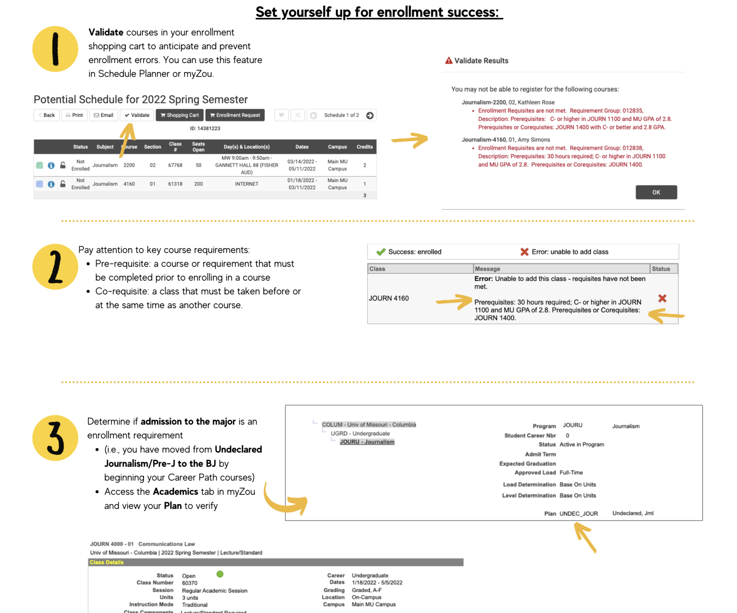
The original page below featured one large image including numbered lists, bullet points, and screenshots directing students to follow along with instructions.
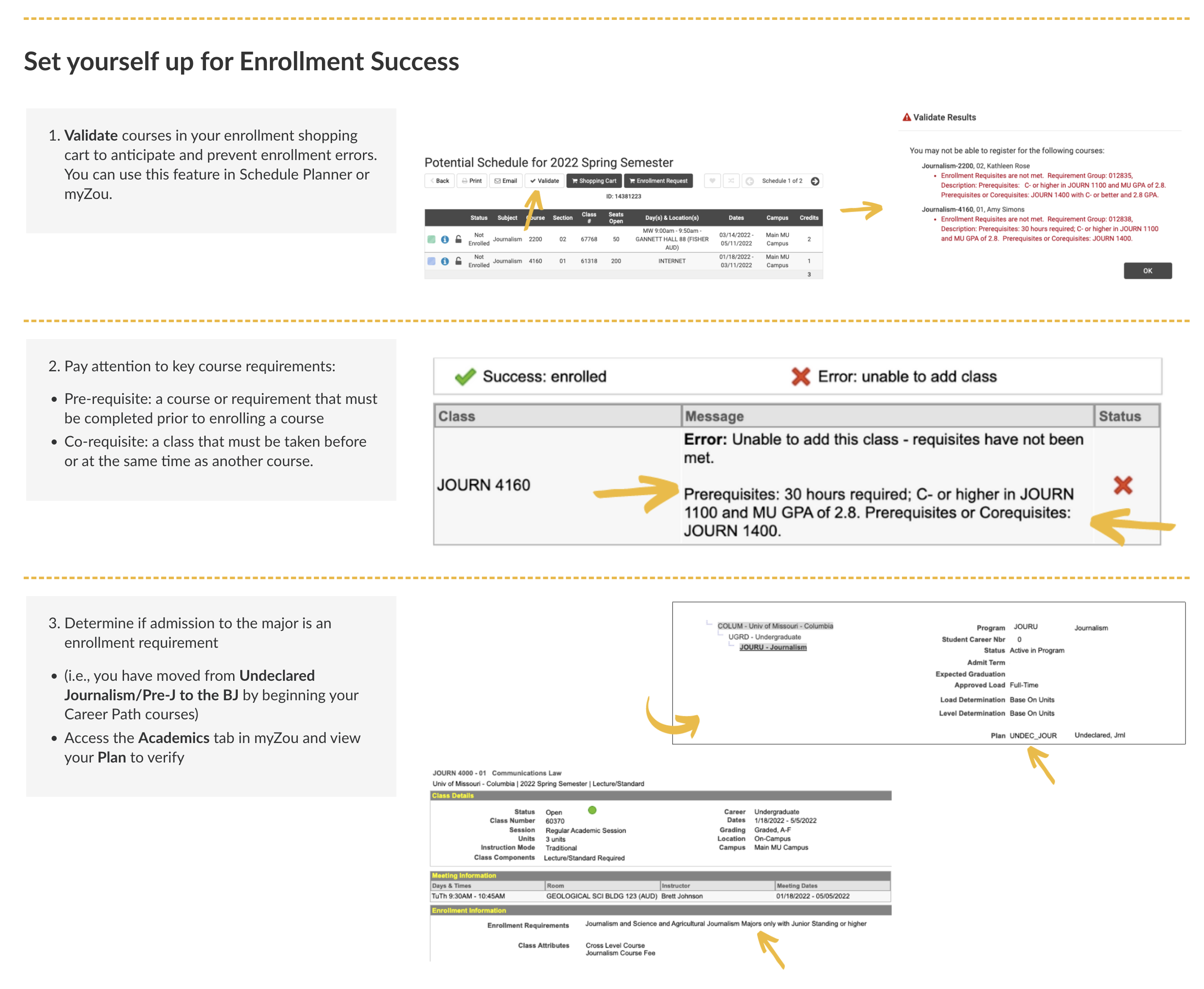
Putting the title and numbered lists as text directly on the page helps with responsive browser sizes and the ability to use a screen reader with the page content. The content in the screenshots is explained in the text, which improves the accessibility of this page as well.
Before: Inaccessible
After: Adjusted for Accessibility
Guideline 2: Use color and design assets to maintain a friendly and casual feel
The original Canvas page relied on colors and graphics to draw the student's eyes to several important key points. Once again, the main text was included on the image itself, making the information inaccessible.
To combat this issue, we simplified the graphics and mimicked the eye-catching yellow key point boxes with HTML and cascading style sheets (CSS)
Before: Inaccessible

After: Adjusted for Accessibility

Guideline 3: Grid layouts are an excellent way to save space and create an interesting design
Once upon a time, web designers frequently used tables to control HTML layout. However, CSS is a more modern and usable way to achieve this. By making use of a CSS grid layout, we were able to transfer text content from an image to the Canvas page, maintaining the relationship between the item topics and simplifying the look and feel of the page. Adjusting the bright yellow color to a softer tone also allows for easier readability.
Also, it's a responsive way to save screen space by placing items next to each other, rather than on a long vertical scrolling page.
Before: Inaccessible

After: Adjusted for Accessibility

Striking a Balance
By following a few basic guidelines, we were able to mimic the original page style, satisfy the faculty by maintaining the idea and vision behind their course, and reduce accessibility issues while putting our fresh take on the informative organizational course site.
Are you interested in redesigning your courses to better ensure accessibility for all of your students? We’re here to help! Please reach out to our learning design team to learn more.
Additional Resources